This project started from a simple idea — to create a warm, inviting brand that feels like a cozy moment shared with a cat. Whisker Wonders is for those who see charm in whiskers, softness in design, and a little bit of magic in the everyday. The identity is playful yet gentle, with lines and type that feel as friendly as a familiar purr.
Project brief
Create a logo and visual identity for a boutique pet brand focused on handmade goods. The style should feel soft, clean, and slightly playful — appealing to pet lovers who appreciate thoughtful design and cozy aesthetics. The identity needs to work well in both digital and print, and reflect a sense of warmth and character.
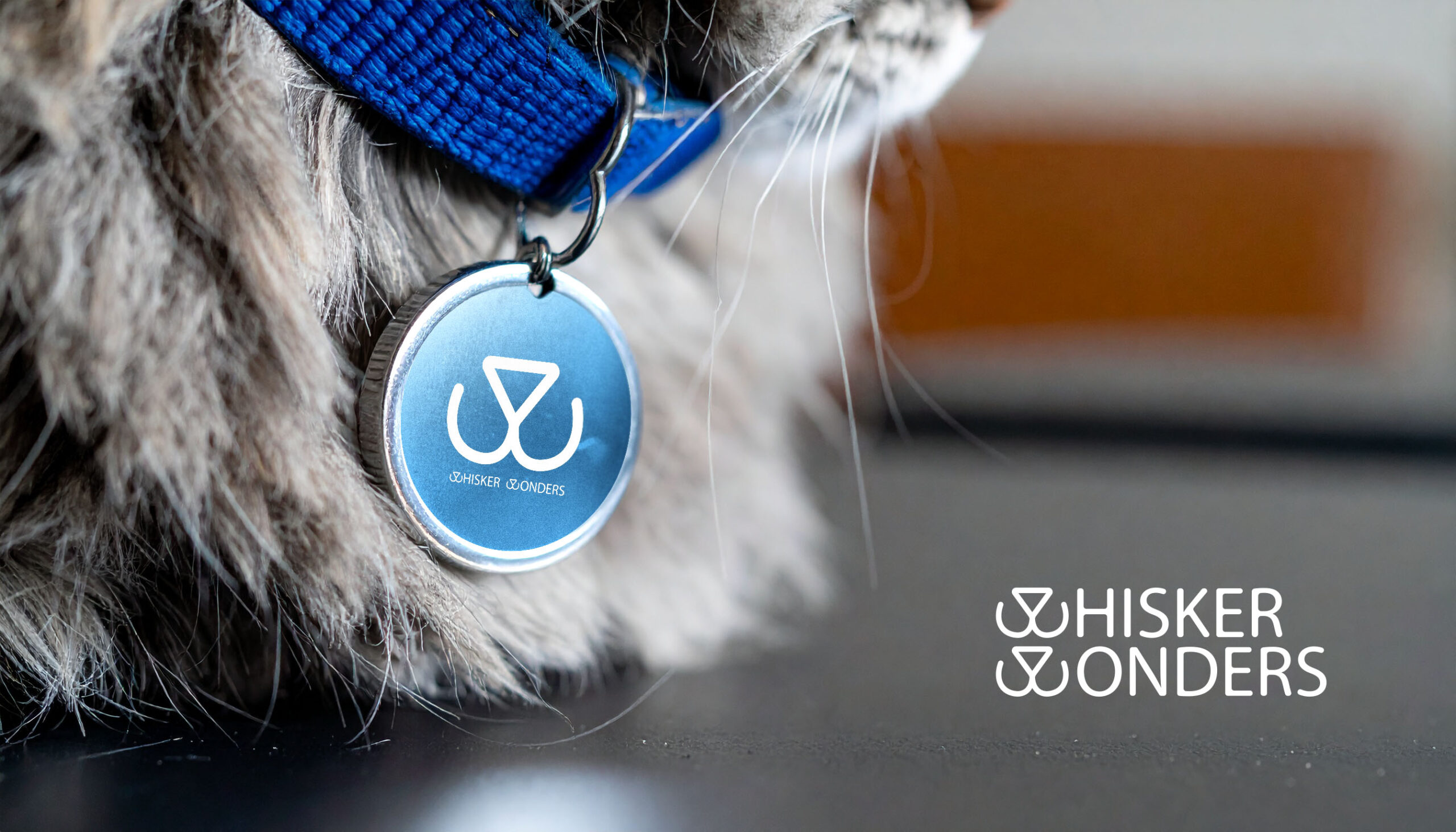
Instead of starting with a bold idea, I let the sketching guide me. The triangle nose came first — simple, recognizable — as it was paired with the mouth, it formed the letter W which is the first letter of both words in “Whisker Wonders”. Every part of the logo was built with the same soft curve in mind. I wasn’t just designing a mark, I was trying to capture a feeling, bring that sense of whimsy into the typography — the curious, gentle personality that cat lovers know so well.
Soft Lines, Clear Voice
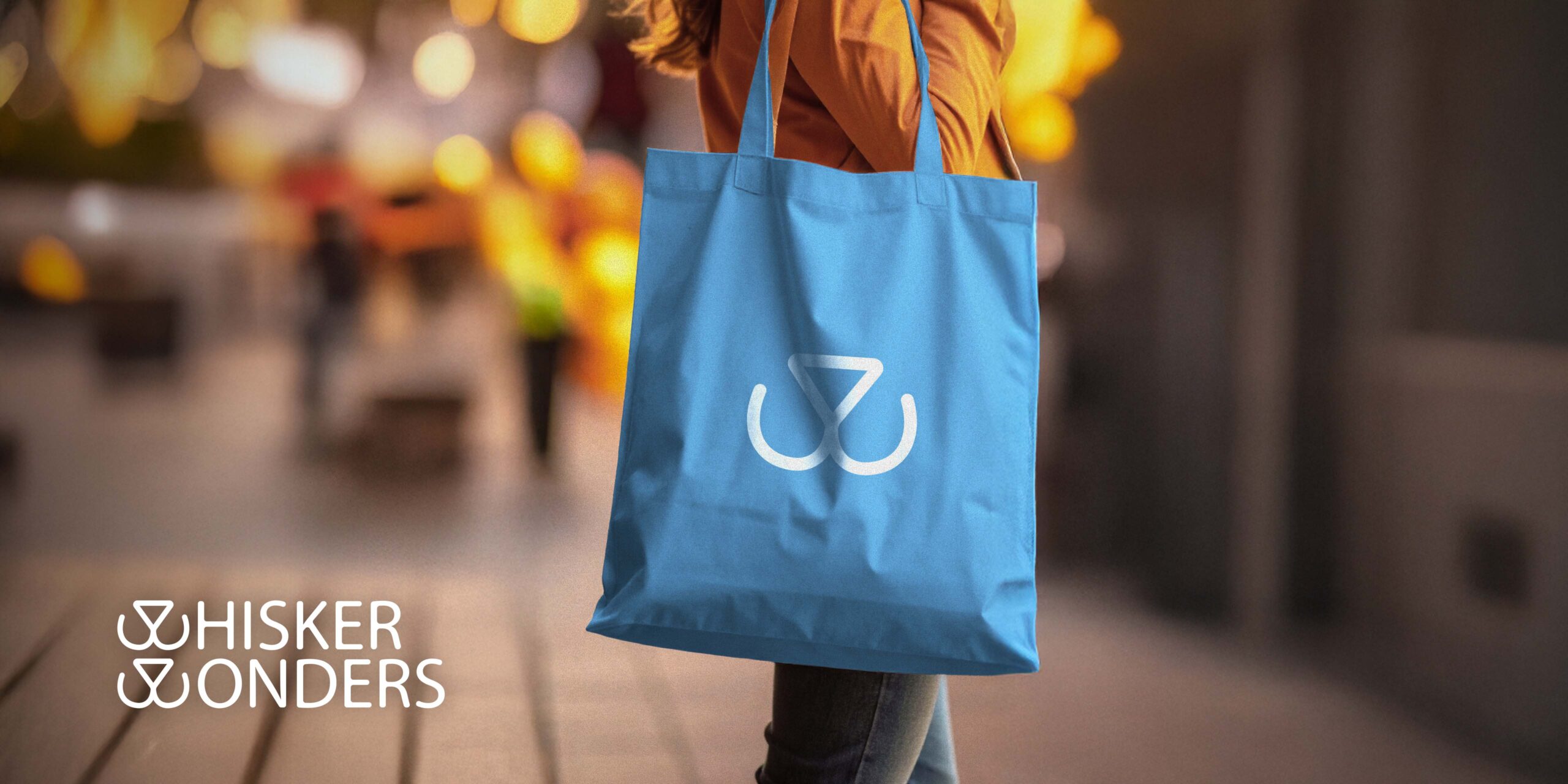
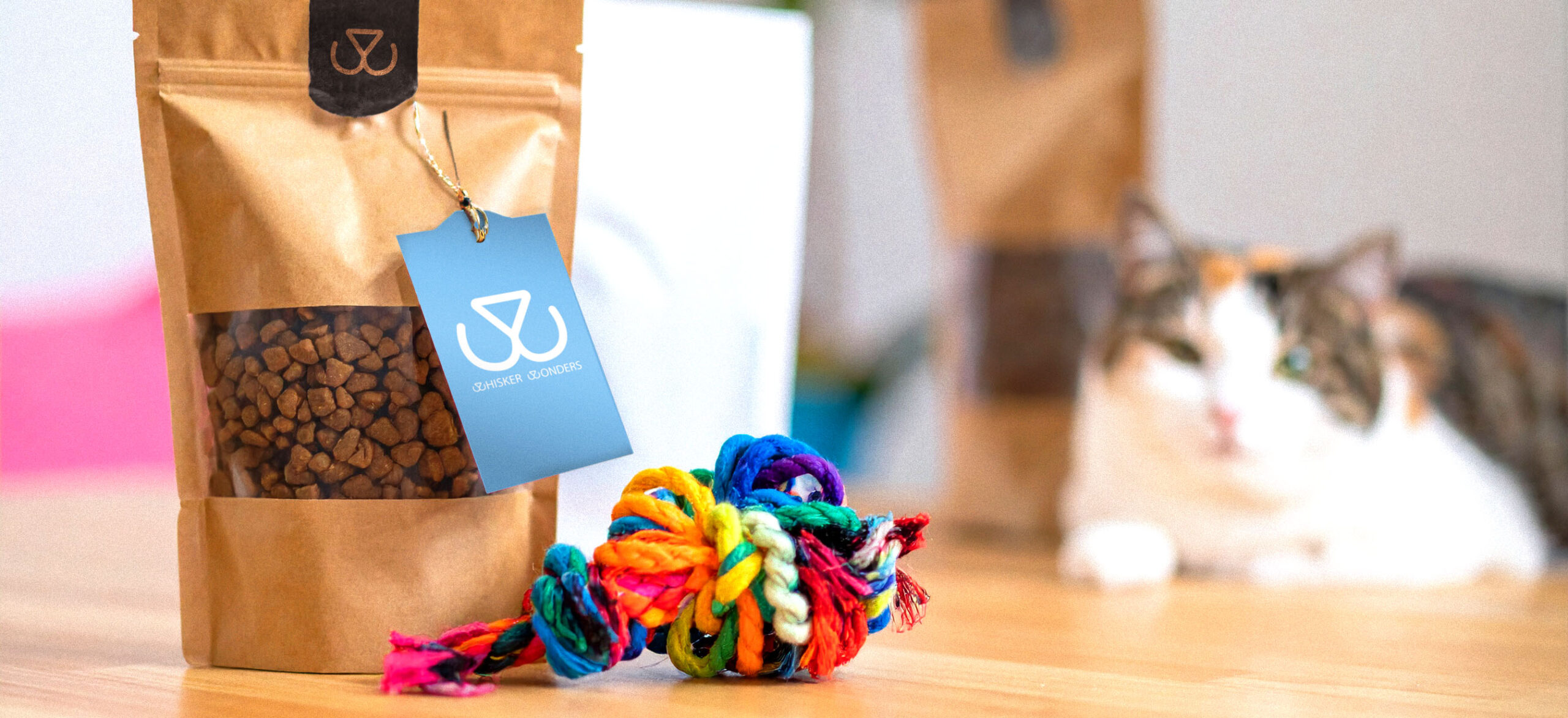
Whisker Wonders uses a calm, natural palette and minimal shapes to express comfort and care. The design system was built to be simple and adaptable — easy to apply across tags, packaging, and social posts, while still keeping that handmade, heartfelt feel.
This project started from a simple idea — to create a warm, inviting brand that feels like a cozy moment shared with a cat. Whisker Wonders is for those who see charm in whiskers, softness in design, and a little bit of magic in the everyday. The identity is playful yet gentle, with lines and type that feel as friendly as a familiar purr.
Project brief
Create a logo and visual identity for a boutique pet brand focused on handmade goods. The style should feel soft, clean, and slightly playful — appealing to pet lovers who appreciate thoughtful design and cozy aesthetics. The identity needs to work well in both digital and print, and reflect a sense of warmth and character.
Instead of starting with a bold idea, I let the sketching guide me. The triangle nose came first — simple, recognizable — as it was paired with the mouth, it formed the letter W which is the first letter of both words in “Whisker Wonders”. Every part of the logo was built with the same soft curve in mind. I wasn’t just designing a mark, I was trying to capture a feeling, bring that sense of whimsy into the typography — the curious, gentle personality that cat lovers know so well.
Soft Lines, Clear Voice
Whisker Wonders uses a calm, natural palette and minimal shapes to express comfort and care. The design system was built to be simple and adaptable — easy to apply across tags, packaging, and social posts, while still keeping that handmade, heartfelt feel.