From User Experience to the shelf – Lumoglow Packaging Design
Lumoglow is a voice- and app-controlled LED bulb designed to give users complete control over lighting ambiance with ease. The challenge was to craft a packaging concept that feels innovative, tech-forward, and accessible—without overwhelming the everyday consumer. Every element, from the product visualization to the iconography, was custom-built with a focus on clarity, functionality, and brand consistency. From initial concept to manual mockup building, this design reflects a thoughtful approach to user experience, branding, and storytelling.
Brief
This packaging design project was created for LumoraTech’s smart LED bulb, “LumoGlow.” The objective was to design a clean, modern retail box that communicates the bulb’s smart features—voice control, app integration, and color customization—while standing out on shelves. The design uses a bright sky-blue palette, minimalist iconography, and soft product rendering to emphasize innovation and simplicity. Clear typography (Montserrat and Inter) and an intuitive layout guide users through the bulb’s benefits and setup in just three steps. The box includes a bold front panel, a features list, instructions, and brand story, with all specs, icons, and visuals developed to match the brand’s sleek, tech-forward identity.
Layout breakdown –
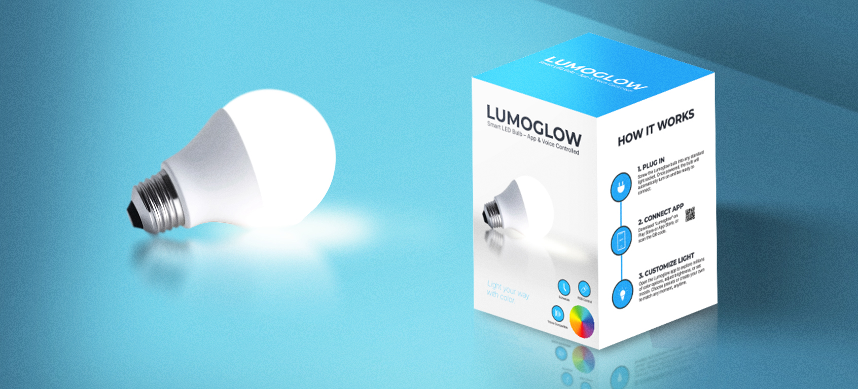
Front Panel: Showcases brand recognition with a glowing product image, tagline, and key selling points.
Side Panels: Use of custom icons and brief descriptions to highlight product benefits and the use of the app.
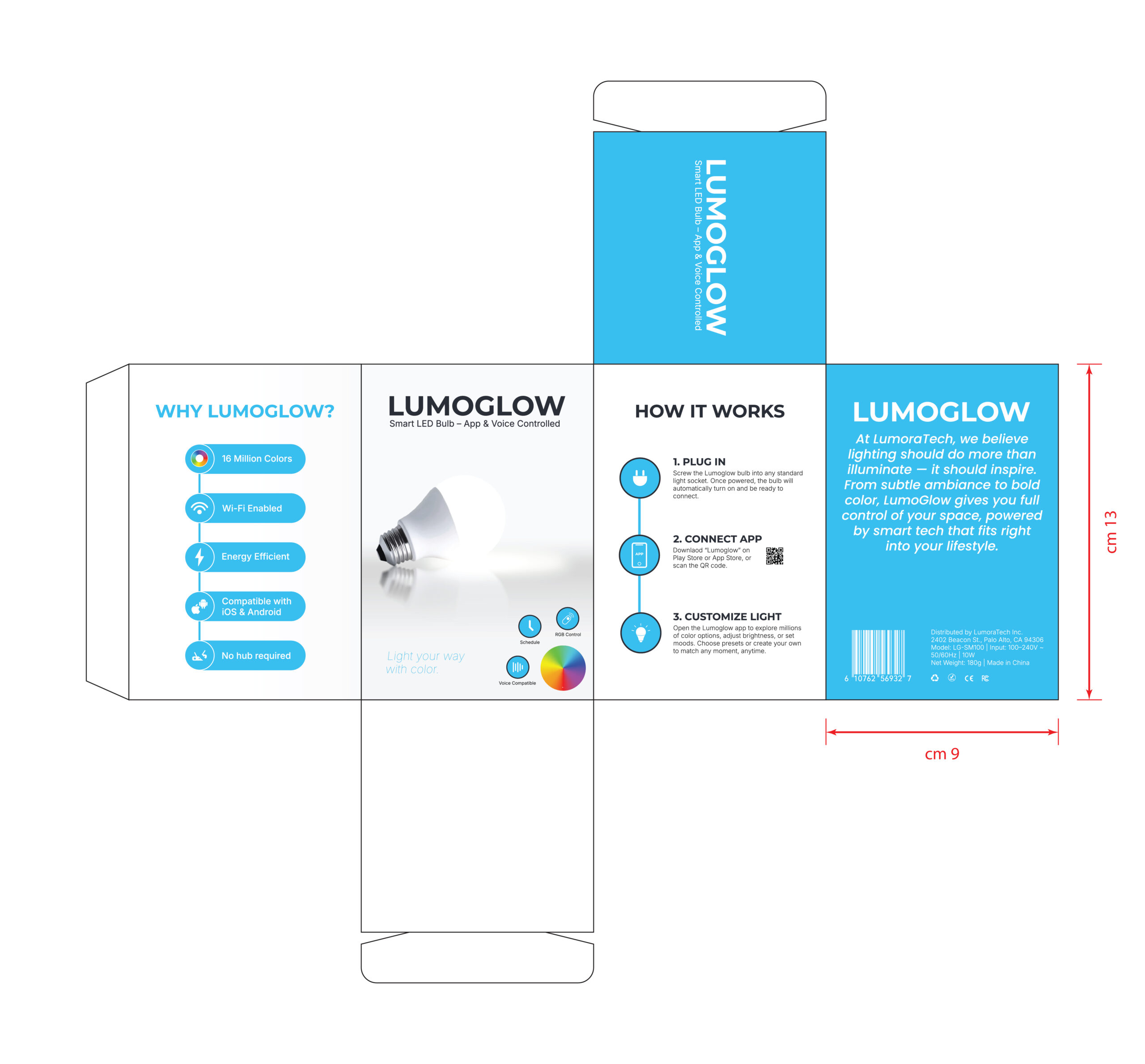
Back Panel: Completes the story with brand values, manufacturer info, specs, compliance icons, and a neatly positioned barcode.
The goal was to create an open, polished layout that balances brand clarity with shelf appeal. The front panel features a radiant product image, bold branding, and a concise tagline, while the side panels communicate key features and a visual “How It Works” guide. The back panel includes brand messaging, product details, certification marks, and barcode—everything arranged in a clean, consistent visual language.
Style guide
The Lumoglow packaging relies on a clean, tech-forward palette—sky blue adds energy and clarity, supported by deep charcoal and crisp white for balance and contrast. For typography, I combined Montserrat Bold for strong, modern headlines with Inter Regular for clean, readable body text. This pairing creates a sleek and approachable identity that reflects the product’s smart, functional design.
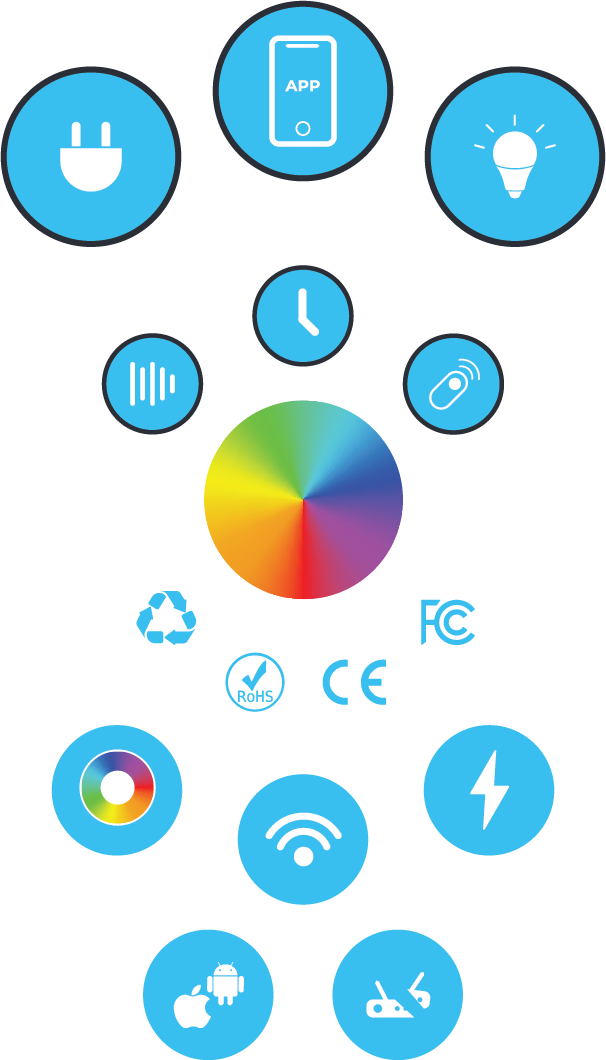
All icons were designed specifically for this project in a consistent monoline style. They visually communicate essential features—Wi‑Fi/Voice Control, Color Wheel, No Hub Required—with clarity and simplicity, while visually aligning with the overall package aesthetics.
Final notes
This project was all about turning a smart tech product into a smart visual experience. I was tasked with designing the full packaging for Lumoglow — a voice- and app-controlled LED bulb that promises intuitive lighting with a bold personality. I built a clean and modern layout with a bright color scheme to reflect the product’s smart capabilities and vibrant lighting features, all styled to maintain consistency and clarity.
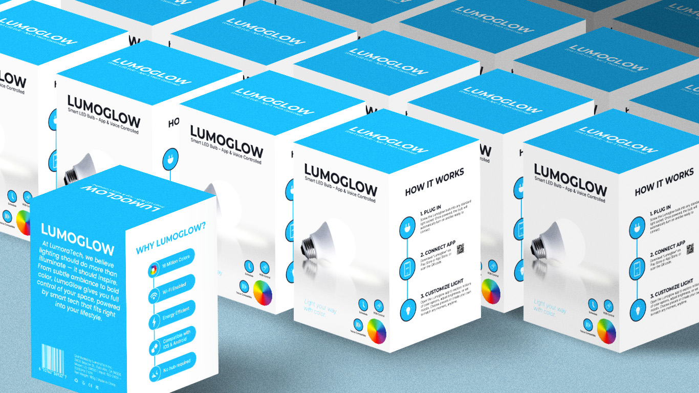
The mockups include a hero presentation of the box and a lineup of multiple units to show scalability and retail shelf appeal. This project gave me the chance to flex both design thinking and visual storytelling — tying together functionality, branding, and user experience in one cohesive package.
LUMOGLOW
From User Experience to the shelf – Lumoglow Packaging Design
Lumoglow is a voice- and app-controlled LED bulb designed to give users complete control over lighting ambiance with ease. The challenge was to craft a packaging concept that feels innovative, tech-forward, and accessible—without overwhelming the everyday consumer. Every element, from the product visualization to the iconography, was custom-built with a focus on clarity, functionality, and brand consistency. From initial concept to manual mockup building, this design reflects a thoughtful approach to user experience, branding, and storytelling.
Brief
This packaging design project was created for LumoraTech’s smart LED bulb, “LumoGlow.” The objective was to design a clean, modern retail box that communicates the bulb’s smart features—voice control, app integration, and color customization—while standing out on shelves. The design uses a bright sky-blue palette, minimalist iconography, and soft product rendering to emphasize innovation and simplicity. Clear typography (Montserrat and Inter) and an intuitive layout guide users through the bulb’s benefits and setup in just three steps. The box includes a bold front panel, a features list, instructions, and brand story, with all specs, icons, and visuals developed to match the brand’s sleek, tech-forward identity.
Layout breakdown –
Front Panel: Showcases brand recognition with a glowing product image, tagline, and key selling points.
Side Panels: Use of custom icons and brief descriptions to highlight product benefits and the use of the app.
Back Panel: Completes the story with brand values, manufacturer info, specs, compliance icons, and a neatly positioned barcode.
The goal was to create an open, polished layout that balances brand clarity with shelf appeal. The front panel features a radiant product image, bold branding, and a concise tagline, while the side panels communicate key features and a visual “How It Works” guide. The back panel includes brand messaging, product details, certification marks, and barcode—everything arranged in a clean, consistent visual language.
Style guide
The Lumoglow packaging relies on a clean, tech-forward palette—sky blue adds energy and clarity, supported by deep charcoal and crisp white for balance and contrast. For typography, I combined Montserrat Bold for strong, modern headlines with Inter Regular for clean, readable body text. This pairing creates a sleek and approachable identity that reflects the product’s smart, functional design.
All icons were designed specifically for this project in a consistent monoline style. They visually communicate essential features—Wi‑Fi/Voice Control, Color Wheel, No Hub Required—with clarity and simplicity, while visually aligning with the overall package aesthetics.
Final notes
This project was all about turning a smart tech product into a smart visual experience. I was tasked with designing the full packaging for Lumoglow — a voice- and app-controlled LED bulb that promises intuitive lighting with a bold personality. I built a clean and modern layout with a bright color scheme to reflect the product’s smart capabilities and vibrant lighting features, all styled to maintain consistency and clarity.
The mockups include a hero presentation of the box and a lineup of multiple units to show scalability and retail shelf appeal. This project gave me the chance to flex both design thinking and visual storytelling — tying together functionality, branding, and user experience in one cohesive package.